

Branding with what?
Good legs go a long way. The first time my mentor said that phrase to me, I did question whether I should be offended. But here's what I learned and what it means to me. It's a brand that can walk long distances; i.e. stay in the game for the long haul. It serves the needs of the business but most importantly, its audience. It can play nice with any media it should come across and has all forms to support each. Long, tall, no color, full color, pieced apart, and all put together. It also must have some sort of emotional effect on its audience that places it squarely in their world, making it useful and memorable.
It is my intention to create brands that show your place in the world. That give context for your audience, so that your business's message or service fits neatly into their lives. When you serve your audience, it'll serve you too.
Filling the gap after a brand overhaul
Sometimes companies do the work to get their identity sorted out, but haven't figured out how to execute it. This is my happy place. Give me a brand book and I can make it work in the context of your business. No matter the medium, your brand should have a clear through line in everything it produces.
Have a great idea but not sure how to make it move?
I wonder how many ideas happen that never get had? What a terrible fate. Over here there are creative collaborators just itching to make your idea happen. Together, we can analyze the factors, the audience, and opportunities you're facing, create an action plan, and get your story into the world effectively.
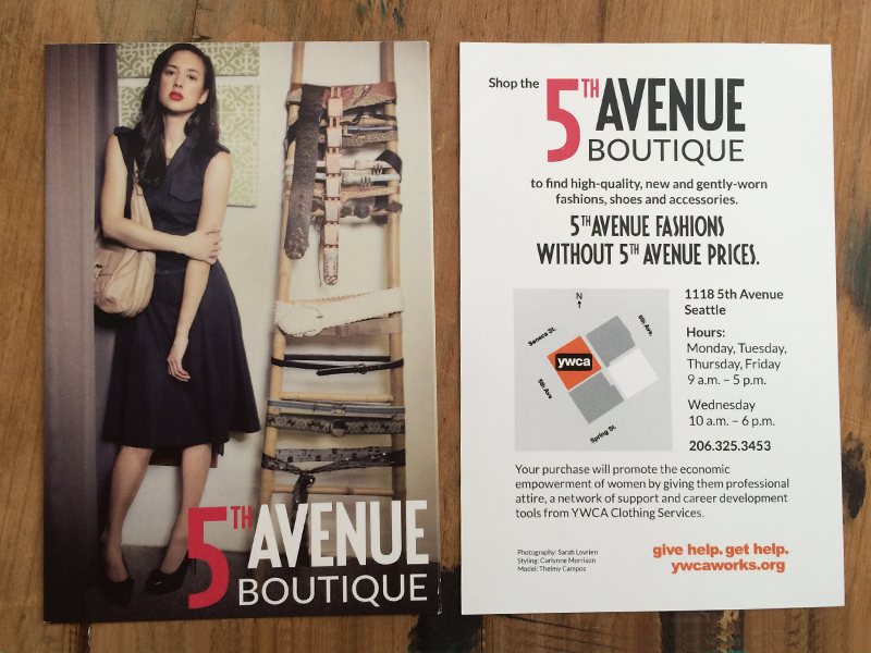
Here's a smattering of some identity and logo work.

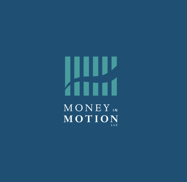
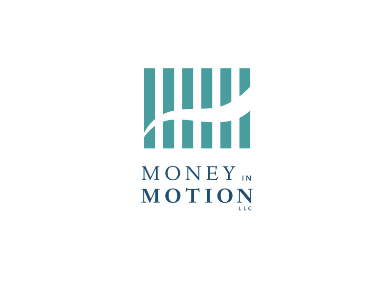
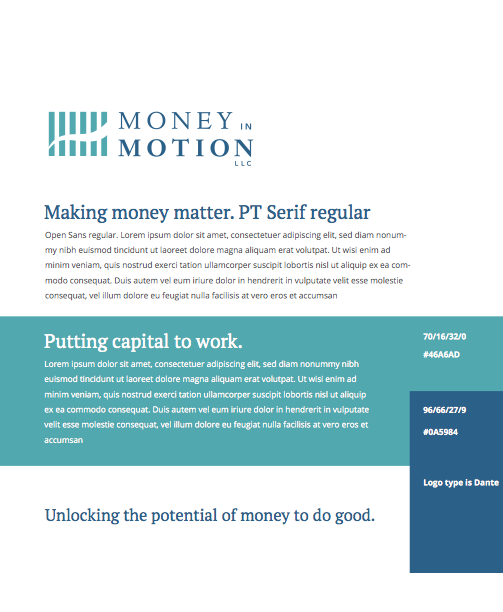
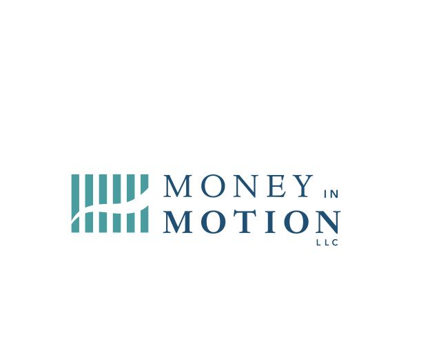
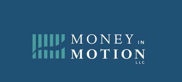
Case study: Money in Motion – identity, website
Money in Motion, LLC works to put 'money to work creating more economic opportunities in underserved communities with a focus on women, financial inclusion and catalyzing social mobility.' I LOVE doing work for folks trying to do good in the world.
Living in a relatively corporate environment, this identity needed to be strong within a financial world but softened with...well...water. One of the themes we began with was how water flows. Flowing water as a "nurturing" but endlessly strong force, paired with a strong financial/corporate feeling came after several interesting directions.
Then two ideas got married, and we got Money in Motion. Making money matter. We even got their cards printed on recycled t-shirt scraps - no trees involved!
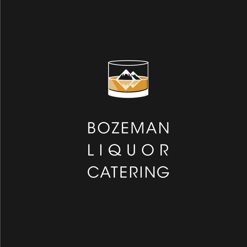
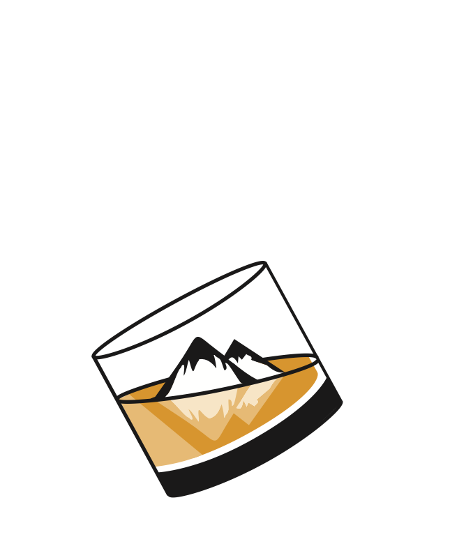
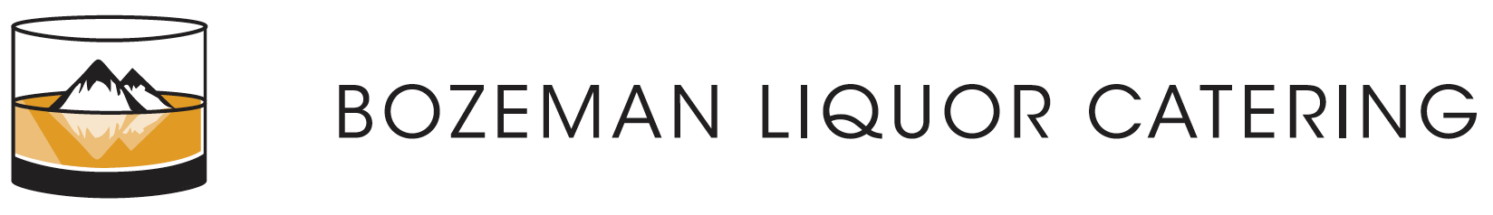
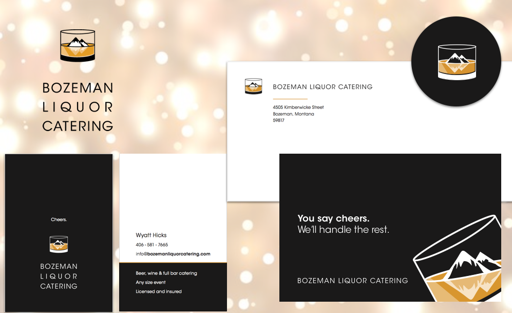
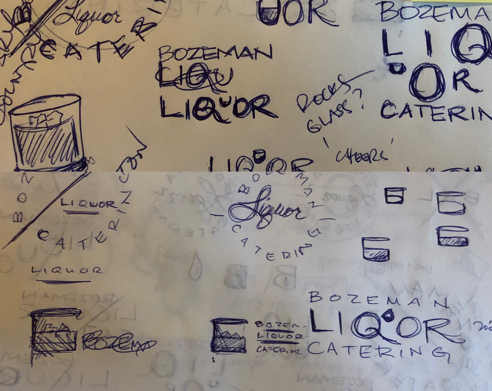
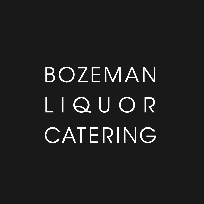
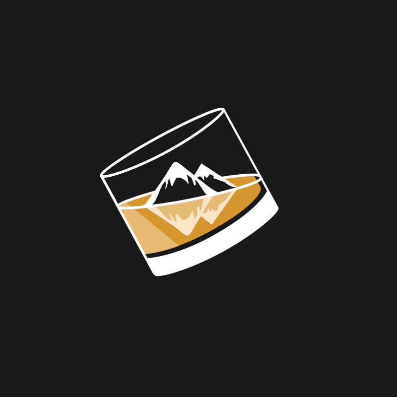
Case study: Bozeman Liquor Catering – identity
Bozeman Liquor Catering is a niche liquor catering company in Bozeman, Montana. They were targeting high end venues as well as individuals looking to have hassle-free catering for their events. Having lived in Bozeman, I was aware of some visual trends around town. We wanted to create something timeless, but with a local feel; something that could be just as comfortable within a black-tie setting as it is outside at a barn-style wedding. That juxtaposition itself seems to be the new Bozeman. So then ice cubes became mountains, and there we have it. This was super fun!
Hit me up if you'd like to chat about your brand.
Thank you!
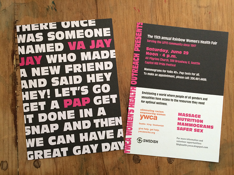
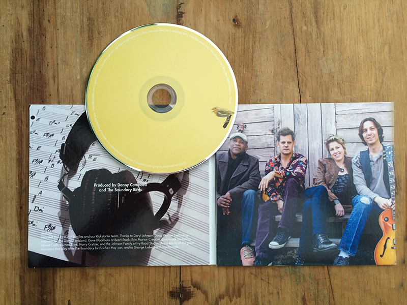
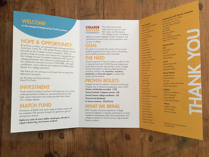
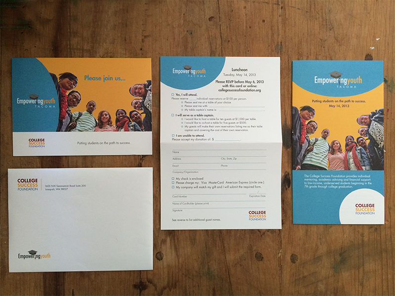
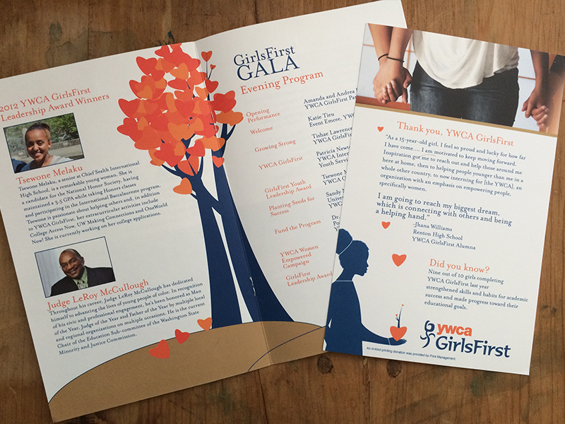
Here's a smattering of some print work.